Less a Goethean observation and a more general observation with reference to the Goethean method (click here to read more about Goethean Observation).
Note: The aim of this observation is not to write a beautiful prose account of the map, but rather to look, observe and find a hook upon which to hang the next piece of research into this subject.
The map has been printed on a large sheet of paper creased vertically and horizontally with lines where the map has been folded and opened. The paper itself is a brownish-white, darker along the lines of the folds and around the edges in places. The corners on the left hand side are a little dog-eared.
The map on one side shows the area concerned – a part of France as the map tells me at the top. This side of the paper is smooth to the touch, but on the reverse I can feel a tooth. Folding over the first fold, I can see the tooth on the ‘reverse’ very clearly. The [fabric of the] paper is made up of very straight vertical lines, with wonkier lines running horizontally. There are four ‘squares’ (actually rectangles) to each folded column and eight folded columns (7 creases) in all. There are four folded rows (3 creases).
The ‘square’ at the top of the first vertical fold on the reverse side of the map tells me this is a ‘Trench Map’. Like the bottom square, the colour of the paper is much darker than the rest. The two squares in between are like the colour of the map on the reverse side – possibly even lighter. This shows how the map, when folded, has a front and a reverse side. Having turned over the map so that this first fold appears on the right I can see all 32 ‘squares’ that make up the map. The folds are particularly prominent, some darker than others. Some of the squares show no sign – or at least – very little sign of wear. There are some splits in some of the folds – caused of course by the repeated action of opening and closing the map.
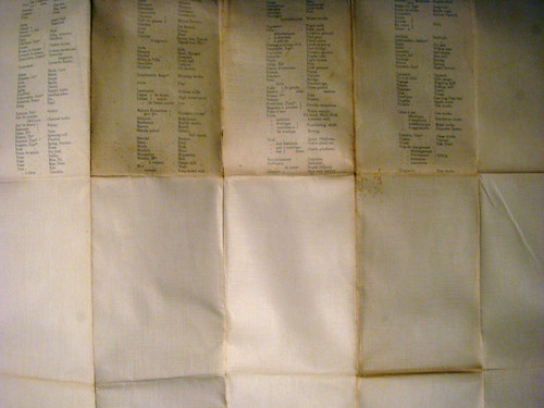
Six ‘squares’ along the top two are covered with words – French words and their English translations. The words are the names of landscape features such as tree (arbre), gate/stile (barrière), oak tree (chêne) and pond (etang). The rest of the squares, including one on this top row are blank. All one can see is the pattern of the paper’s fabric.
Turning the map over, one is aware of the holes and the sound the paper makes. It reminds me of a soft version of the crackle of a fire.
The drawing of the landscape takes up much of this side of the paper with explanatory texts and a key beneath as well as to the right of the map.
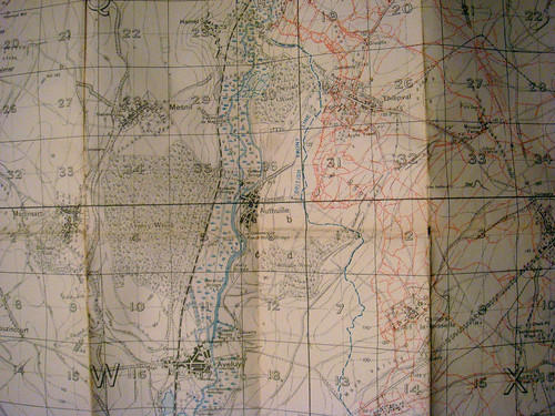
Looking at the details of the map, one can see the various features of the landscape – the woods, roads, hills (through contour lines), rivers, ponds or lakes and of course various towns and villages. All these features, along with the names and the grid are printed in a ‘black’ ink which actually appears as a light ‘browny’ grey.
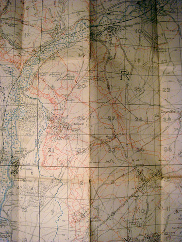
What one’s eye is drawn to straight away however are the patches of colour on the right hand side of the map; blue and red. The colours have been used to colour a multitude of lines which run from the top of the page to the bottom. The majority of these are red. There is one dashed blue line which snakes from top to bottom to the left of the furthest-most red line and to the left of that, the same colour has been used to mark out the landscape features showing rivers, lakes and what appears to be marshy land.
The red lines themselves have been drawn in a sort of ‘stepped’ way and cover a quarter of the map up to the right hand side. Looking closely at these lines, one is made aware of the other lines of the map – black curved lines, straight vertical and horizontal lines; straight vertical and horizontal dotted lines – these lines divide each square (delineated by the other straight lines) into four quarters.
In each of the large squares there are numbers, the greatest of which appears to be 36. Among some of these numbers, there are also letters – P, Q, R, V, W, X.
As I look at the map I begin to notice the mix of French and English words/names. The place names are clearly French; La Boiselle, Thiepval, Authuille, Contelmaison, Beaumont-Hamel. In amongst these however are names like Tara Hill, The Crucifix, Railway Copse, Brickworks, Pond Bridge and Cemetery. There also appear to be instructions: ‘35 to 40 ft deep: Impractical for Cavalry.’ There is also a largish hole above Pozières.
Folding the paper up, it fits entirely in my hand. It is like a concertina, about an inch thick without too much pressure applied.
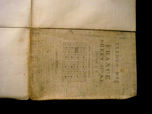
Looking more closely at the front of the folded map, I can see the words:
Trench Map
France
Sheet 57D S.E.
Edition 2.D.
There is then a diagram – an ‘index to adjoining sheets’ beneath which are the words and numerals:
Scale: 1/20,000
On the left hand side of this ‘face’ are what appear to be two initials, DM. The map smells of its age, a musty smell of something that for a long time was forgotten.
On the diagram I can see a small square which has been shaded in to distinguish it from all the others. One can see that this piece of paper is part of a much larger map measuring ‘eight maps’ wide and ‘eight maps’ high.
The map is clearly old. The date 1916 has been printed on the ‘map’ side, but even without this, the style of the printing and the condition tells me it’s of some age. Through its age it has expanded in its folded form. The folds aren’t as crisp as they were. It has no doubt lain forgotten in an attic or some such place, acquiring its patina and its smell. As the dust has grown, the text has faded, although the edges of each letter are crisp. And still I can see the ‘DM’ in pencil on the left hand side.
It doesn’t resist being folded again. First vertically and then horizontally.
I unfold it and instinctively flatten it down. The folds in places rise up. The fold which runs vertically through the red lines does especially. This part of the map won’t remain flat unless I press it down with my hand. As I do, my head instinctively lifts a little and my eyes move along the lines of red to rest around the village of Thiepval.
These actions would no doubt have been repeated in the past when the map was perhaps more pristine – when the folds were sharper and the map lay flat.
The map, when I lift it up, seems to want to fold into a particular shape. It doesn’t want to be put away, but rather be folded so that two columns remain in view. The folds which delineate this part are a darker brown than all the others. In this section of the map is a concentration of red lines and blue lines.
The way it folds suggests that this was what was most important. When I pick up the map to fold it completely, it folds so that the ‘front’ and ‘reverse’ are tucked away. The front now is one of the segments or ‘squares’ containing French words (Sondage) and their English equivalents (Boring – as in cut).
The past movements associated with this map are therefore recorded in its folds. It resists being folded any other way.
We know the map was made in 1916 with minor corrections to details on 15.8.16. This is just six weeks after the first offensive in the Battle of the Somme. Shortly after this period the map would have been replaced with another as the landscape changed with each offensive.
When I look at this map from the comfort of my own front room I see history – albeit one written in a less conventional way. It still has words and pictures.
For much of its life it was no doubt a curiosity. Maybe it was a reminder for those that were there who when looking at the lines would have seen something very different – not on the map but in their minds.
Those who used the map would have seen something else. By August 1916, the colossal tragedy of the first day of the Somme would have been etched on everyone’s mind. The contour lines can hardly tell the reality of the ground’s undulations, and yet it was these which meant the difference between life and death. The map serves to distance us from reality.
Considering its past, the action of being folded and then unfolded over and over, one can almost imagine a bellows lifting and then depressing, letting out air like a breath – a last gasp.
The map is like a palimpsest, albeit one which is just a single print. One can see the original landscape which over the years changed as landscape features assumed English monikers. It is a place that appears at once to be real and imagined – a non sort of place.
‘The Poodles’, ‘The Dingle’, ‘Willow Patch’, ‘Round Wood’, ‘Birch Tree Wood’, – they all have the sound of something made up – a children’s story. ‘Middle Wood’, ‘Villa Wood’, ‘Lonely Copse’. There is even marked ‘a row of apple trees’. These names – these alien names – all appear on the right hand side of the map; on the left, large swathes of woodland go unnamed.
The same is true of road names.
Observation of certain parts of the map has changed the way it moves – these movements seem impressed into the map’s fabric.
When I stand to look at the map, I stand as, no doubt, others stood around it. I can again imagine the creases as sharper, the colour of the paper whiter, the lines more vivid.
Looking at the map, unfolding it and folding it, smoothing down the paper, one gets the sense of an individual. 1/20,000. The map as an object tells me about the individual who looked at it. What is pictured tells me – when I think of the scale – about the thousands of men killed on that first day of the Somme.
One gets the sense of other maps printed before this one, upon which this one is based – each one covering over the horror of the most recent losses of life. They become like shrouds.
Each one would have been used to plan the next map, and the next, and so on, until there weren’t any red lines left.


